Five Prototypes, Five Ways of Seeing
- kiran kulkarni
- Jul 8, 2025
- 6 min read

Notes from a season of testing, making, and listening
Over the past few months, I found myself moving between very different kinds of projects — a board game, a mural, a book, a signage system, and a house. Each prototype felt like a question, often disguised as a design decision. Will this engage? Will it guide? Will it feel good underfoot or draw the eye upward?
This post isn’t about finished work. It’s about that shimmering in-between space where we test, observe, and let go of assumptions. Where the users — readers, visitors, players, walkers — complete the design with their attention, confusion, delight, or disinterest.
🌪️ 1. Board Game Prototype: Collaboration, Conflict & Craving More
We tested the game with three very different tribes — seasoned gamers, curious enthusiasts, and even domain experts. What surprised me wasn’t how they played, but how long they stayed. Over 45 minutes of focused engagement every episode across the board — a rare feat in today’s attention-thin world.
What worked?The cooperative mechanic stood out — players loved working together toward a shared goal, watching individual moves ripple through the team. The traitor twist, though? Divisive. Some found it thrilling, others resented the deception. But maybe that tension is a good thing — it created strong emotions.
There were high notes — moments when someone used their character’s ability just right, when the group barely scraped through a mission, when a plan came together. Re-playability came in at a healthy 7/10 — good, but not unforgettable yet.
Where next?We're thinking episodic structure — self-contained arcs that still leave room for players to want “just one more”.We’re adding narrative depth, making every item, location, and power carry story.We’re weighing two paths:– Support high player counts with meaningful action and minimal downtime,– Or tighten the game to fewer players for more focused strategy.
And most importantly: giving more agency. We want players to feel like they can truly alter the fate of the game, not just react to it.
This prototype reminded me: the best games don’t just entertain — they invite you in and let you co-write the story.


🎨 2. Mural Prototype: Not Art, But Joy
We painted a mural in the stairwell of an art museum — not to exhibit art, but to elevate the experience of climbing stairs. It was never meant to be part of the gallery. It was play, delight, vertical rhythm — something that pulled the eye upward as the feet climbed.
But intention doesn’t always translate.Some senior artists saw it and revolted. To them, it looked like artwork, and worse, it clashed with the curated pieces. Letters were written to remove this installation. The verdict of stakeholders: paint it white.
We did test it. Museum-goers found it cheerful, even charming. No one expressed confusion. But we hadn’t gathered enough data to shift the minds of the curators. And maybe, that wasn’t the point. We painted it white.
Not with bitterness, but with a kind of cooperative surrender. A reminder that being a designer doesn’t mean always defending your work. Sometimes, it means letting go with grace.


📖 3. Book Prototype: Reading Before Seeing
The idea was simple: orchestrate traditional paintings of Pattachitra art and use them to retell the Ramayana for children. Visual panels would stretch across the pages — bold, narrative, intricate. We thought the pictures would lead. The words would follow.
But when we tested it, the children surprised us.
They read first. Quietly, steadily. Their eyes scanned the text while the vibrant visuals lay untouched, unnoticed in their first pass. Only later — a few pages in — did they begin to return to the pictures, almost like detective work. “Where is that forest?” “Is Hanuman here?” They began searching for clues in the art after the story had already gripped them.
They skipped chapters too — especially ones with more action or dramatic turns. And some looked for humor in the paintings — small jokes, playful expressions — and were left a bit disappointed.
What we learned: the balance of text and image is not sequential but cyclical. Children go to stories for drama, for clarity, for control. Pictures are not always the doorway — sometimes, they’re the echo.


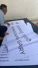
🪧 4. Signage Prototype: Leading Without Loudness
This was a quiet prototype — room names for an art gallery, tested not on screens or mockups, but printed at full scale and pasted into the actual space. We wanted to see what the signs did in context, not in theory.
We looked at readability, legibility, distance, semantics, and how the typeface behaved against real light, shadow, and surface. Visitors could read the names easily. More importantly, they could lead themselves, moving from room to room without asking anyone.
The signs didn’t shout. They blended into the architecture, subtly suggesting where to go rather than commanding it. That was the point — for the signage to support the gallery, not compete with it.
There was a request from the builders: they wanted their name signage a bit bigger, to highlight their contribution. Fair ask. We adjusted, without disrupting the overall design language.
This test reminded me: good signage is invisible until it’s needed. When it works, people barely notice it — and that’s the compliment.


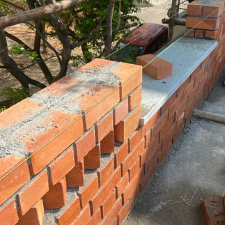
🧱 5. House Prototype: Bricks, Breathing Walls & Hidden Wires
I had the chance to take many design decisons on a architectural project of a house. What started as a simple experiment with bricks became a full-on investigation into surfaces, structure, and systems.
Brick Patterns
I explored how brick bonds could define not just structure, but rhythm. They framed window heights, set visual lines across the walls. But too many patterns? They overwhelm. The wall stops being a wall and becomes noise. I learnt where restraint matters.
Lime vs Cement Finish
Lime plaster is alive — it breathes, holds onto touch, and stays raw. It's slower to dry, softer to the nail, and more sustainable. Cement plaster, on the other hand, is industrially sharp. I used one mix that had 90% manufactured sand and 10% cement. It set fast, strong, but didn’t forgive. In contrast, lime is forgiving but temperamental — like clay versus plastic.
Electrical Lines in Brick Walls
This was fun: how do you run an electric wire on a wall you don’t want to conceal? I chipped through the mortar joints, ran a flexible pipe with the wire inside, and plastered it back neatly. It’s hidden, but not buried — a smart compromise between purity and practicality.
This prototype taught me that architecture isn’t just about form — it’s about decisions at every joint, every surface, every scratch that stays.


What did I learn?
Looking back, these five prototypes weren’t just tests of form or function — they were tests of attention. Of how we think when we design across scales, mediums, and stakes.
From a small board game to a brick-and-mortar house, each one demanded a different kind of seeing:
The board game asked for systems thinking, flow, feedback loops — how player choices ripple.
The mural tested spatial emotion — how color and form alter a person’s mood in motion.
The book made me question narrative timing — when do people read? When do they see?
The signage taught semantic restraint — leading without overwhelming.
The house brought out the hardest — material decisions, tolerances, services, labor, weather.
Each prototype placed me in a different context — a museum, a construction site, a classroom, a gallery, a game night— and each forced a different set of compositional and functional trade-offs. Some prototypes had industrial constraints. Some had cultural ones. Some had human biases I didn’t anticipate.
So what mindsets helped?
Be flexible with scale.Don’t treat space the same way you treat sequence. What matters in a board game (tension, payoff) isn’t what matters in a house (breath, light, structure). Zoom in and out constantly.
Listen early. Listen differently.Some users talk. Some act. Some frown. Some skip. You’re not always looking for feedback — you’re often looking for patterns of behavior. That’s data too.
Balance ego with empathy.Sometimes, the mural gets painted white. The signage gets shrunk. The game mechanic you loved gets cut. That’s not defeat — it’s dialogue. Design isn’t a signature, it’s a conversation.
Design is not just making — it’s sequencing decisions.Every project demanded decisions on composition, color, function, material, assembly, semantics, finish, affordance, and interaction. But not all at once. The art was in when and how we made those choices.
Hold multiple aesthetics at once.Functional doesn’t mean ugly. Playful doesn’t mean shallow. Raw doesn’t mean lazy. Every prototype carried its own logic of beauty — sometimes loud, sometimes hidden.
Detail is never minor.Whether it was the kerning on signage, the corner where a pipe meets a brick, or the child pausing on a visual — every detail was a moment of choice. Details are how users understand care.
In the end, prototyping across these projects reminded me:Design isn’t about getting it right at first. It’s about making thoughtfully, observing generously, and changing humbly.That’s what I want to carry forward. At any scale.
Note:
I used ChatGPT to help structure and refine parts of this article — especially in translating scattered notes into a more readable narrative. The voice, decisions, and stories are mine; the AI was a helpful assistant in shaping them.


Comments